Dance School Website Redesign
Dance School Website Redesign
Revamped the Ruchi Sanghi Dance website, aiming for 35% more engagement, 25% more inquiries, and lower bounce rates.
Revamped the Ruchi Sanghi Dance website, aiming for 35% more engagement, 25% more inquiries, and lower bounce rates.
Overview
Overview
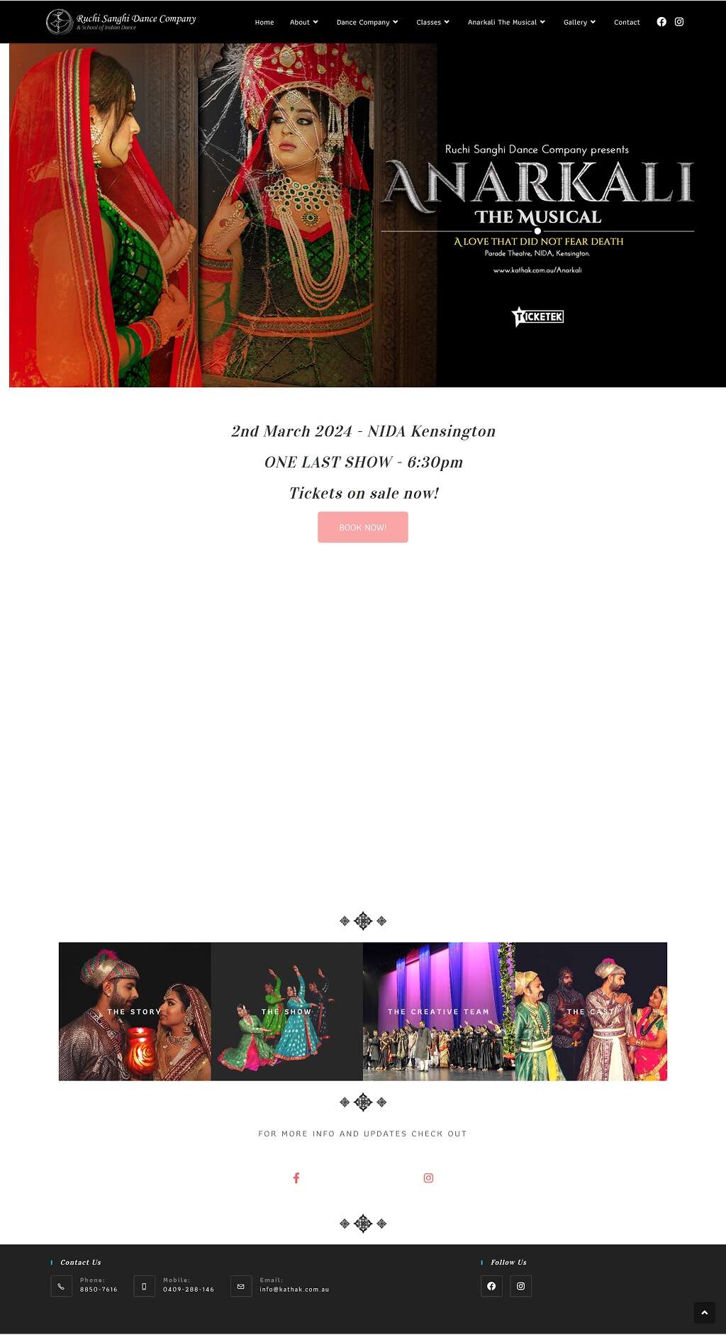
Ruchi Sanghi Dance Company (RSDC), a leading Kathak dance school, needed a modern, engaging website to showcase its rich heritage, attract new students, and highlight its performances.
Ruchi Sanghi Dance Company (RSDC), a leading Kathak dance school, needed a modern, engaging website to showcase its rich heritage, attract new students, and highlight its performances.
Goals
Goals
Modernise the website to enhance aesthetics, streamline navigation, and improve student acquisition and engagement.
Modernise the website to enhance aesthetics, streamline navigation, and improve student acquisition and engagement.
Users
Users
Potential students, parents, event organisers, and those interested in Indian classical dance.
Potential students, parents, event organisers, and those interested in Indian classical dance.
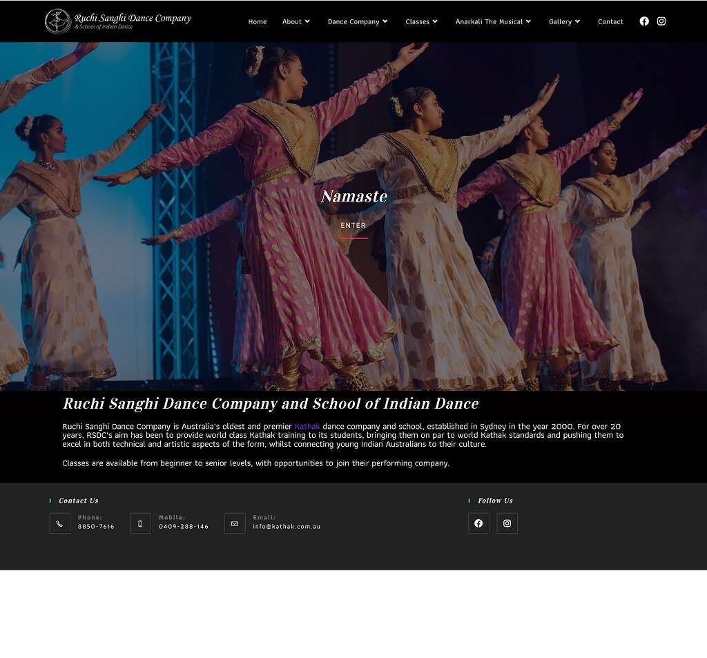
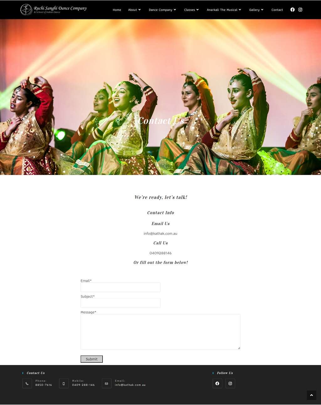
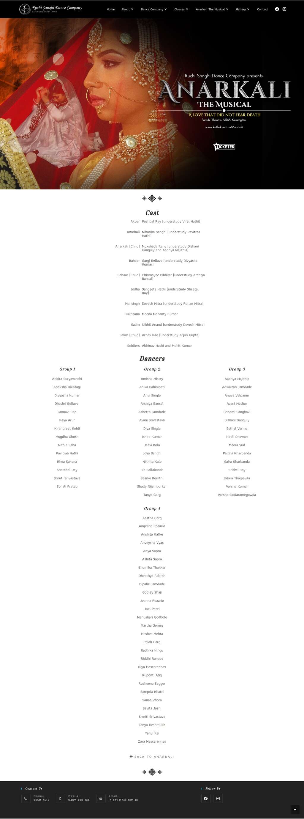
Current Design/State
Current Design/State

Target Audiences & Their Needs
Target Audiences & Their Needs
Persona Groups
Persona Groups
To identify the target audiences, I collaborated closely with stakeholders to clarify and define key user groups. I conducted in-depth interviews with both existing and potential users to uncover their goals, challenges, and motivations. Through qualitative insights gained from these interviews, combined with secondary research, I segmented users into distinct audience groups based on shared needs, behaviors, and priorities.
The redesign prioritised the ‘Culturally Curious’, as beginners represent the largest growth opportunity for RSDC.
Culturally Curious
"I want to learn an Indian dance style, but I’m not sure where to start."
Devoted Dancer
"I’ve been dancing for years and want a school that helps me grow."
Parent Planner
"I’m looking for a trusted and engaging dance school for my child."
Event Explorer
"I’d love to watch a captivating Indian dance performance."
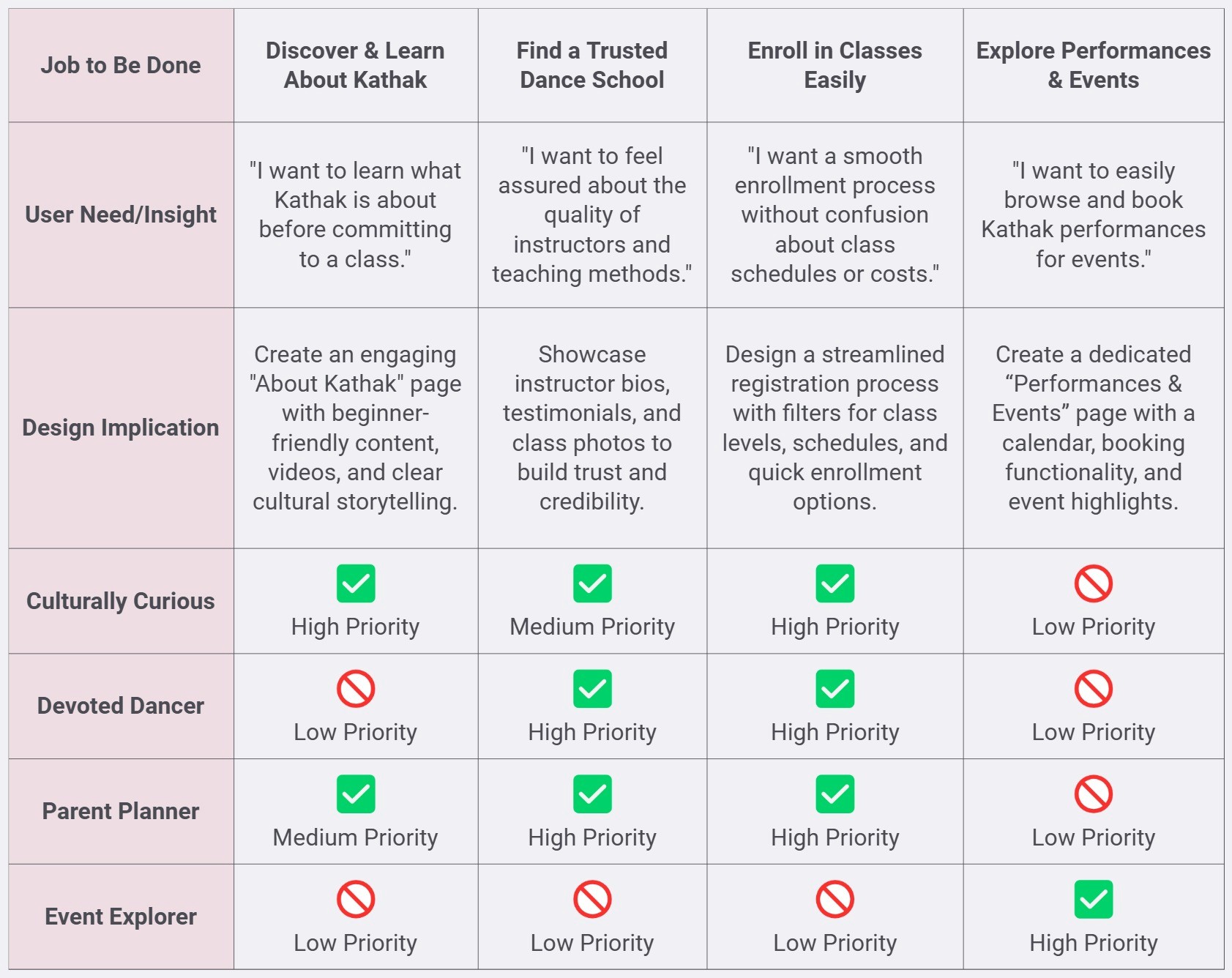
Persona-to-JTBD Matrix
Persona-to-JTBD Matrix
To effectively address user needs, I mapped persona groups to key Jobs to Be Done (JTBD), prioritising 'Discover & Learn About Kathak' and 'Enroll in Classes Easily' to drive beginner engagement and streamline the enrollment process.
To effectively address user needs, I mapped persona groups to key Jobs to Be Done (JTBD), prioritising 'Discover & Learn About Kathak' and 'Enroll in Classes Easily' to drive beginner engagement and streamline the enrollment process.
Research Methods
Research Methods
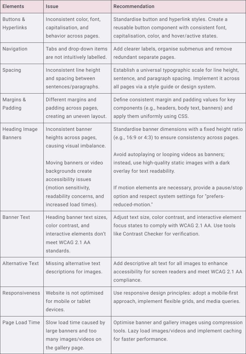
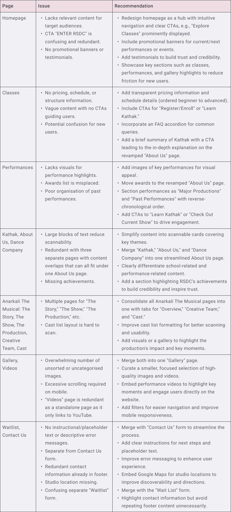
Design Audit
Design Audit
Content Audit
Content Audit
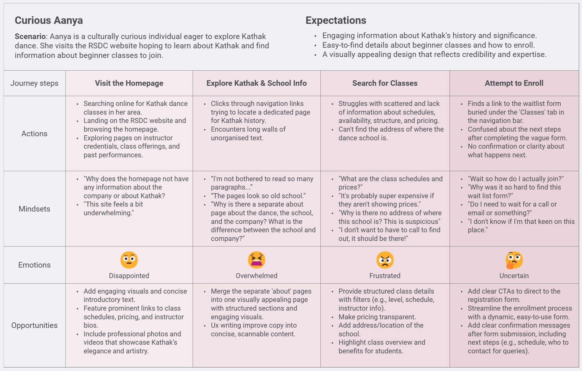
As-Is User Journey Map
As-Is User Journey Map
User Surveys
User Surveys
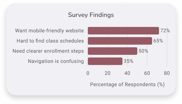
Distributed surveys to current students, parents, and event organisers to gather pain points and suggestions for improvement. Feedback from 36 respondents that main pain points that needed a higher focus is to make the site responsive and more user friendly for potential new students who are 'Culturally Curious'.
Distributed surveys to current students, parents, and event organisers to gather pain points and suggestions for improvement. Feedback from 36 respondents that main pain points that needed a higher focus is to make the site responsive and more user friendly for potential new students who are 'Culturally Curious'.
Competitive Analysis
Competitive Analysis
To identify opportunities for differentiation and improvement, I analysed the websites of established Kathak and Bollywood dance schools such as Chitresh Das Institute and Swastik Dance Company. Key findings included:
To identify opportunities for differentiation and improvement, I analysed the websites of established Kathak and Bollywood dance schools such as Chitresh Das Institute and Swastik Dance Company. Key findings included:
Clear Navigation and CTAs
Clear Navigation and CTAs
Both competitors emphasise user-friendly navigation with prominent CTAs, such as “Enroll for Classes” or “Class Schedule,” enabling effortless exploration of offerings.
Both competitors emphasise user-friendly navigation with prominent CTAs, such as “Enroll for Classes” or “Class Schedule,” enabling effortless exploration of offerings.
Engaging Homepage Elements
Engaging Homepage Elements
Features like moving banners and slideshow carousels are used to showcase performances, highlight class schedules, and create a visually engaging first impression.
Features like moving banners and slideshow carousels are used to showcase performances, highlight class schedules, and create a visually engaging first impression.
Comprehensive Class Information
Comprehensive Class Information
Detailed explanations of class levels, schedules, and admission requirements help users understand offerings and enrollment processes, reducing confusion.
Detailed explanations of class levels, schedules, and admission requirements help users understand offerings and enrollment processes, reducing confusion.
Key Insights
Key Insights
Confusing Inquiry Forms
Confusing Inquiry Forms
Inquiry forms led to incomplete submissions from potential students and event organisers.
Inquiry forms led to incomplete submissions from potential students and event organisers.
Key Features Not Highlighted
Key Features Not Highlighted
Didn't clearly communicate the company's history, Kathak’s beauty, or RSDC’s expertise.
Didn't clearly communicate the company's history, Kathak’s beauty, or RSDC’s expertise.
Class Confusion
Class Confusion
Users dropped off due to unclear class information and missing pricing information.
Users dropped off due to unclear class information and missing pricing information.
The Problem
The Problem
Challenges
Challenges
Cluttered Navigation
Cluttered Navigation
Hard for users to find class information.
Hard for users to find class information.
No Clear CTAs
No Clear CTAs
Low engagement, and confusing to book.
Low engagement, and confusing to book.
Formal Language
Formal Language
Made the site feel unapproachable.
Made the site feel unapproachable.
No Upfront Pricing
No Upfront Pricing
Caused hesitation in inquiries.
Caused hesitation in inquiries.
“How Might We” Questions
“How Might We” Questions
Simplify navigation for easy access to classes, bookings, and performances?
Present complex class structures in an easy-to-understand way?
Create engaging CTAs to encourage user inquiries and bookings?
Design Process
Design Process
Ideation & Wireframing
Ideation & Wireframing
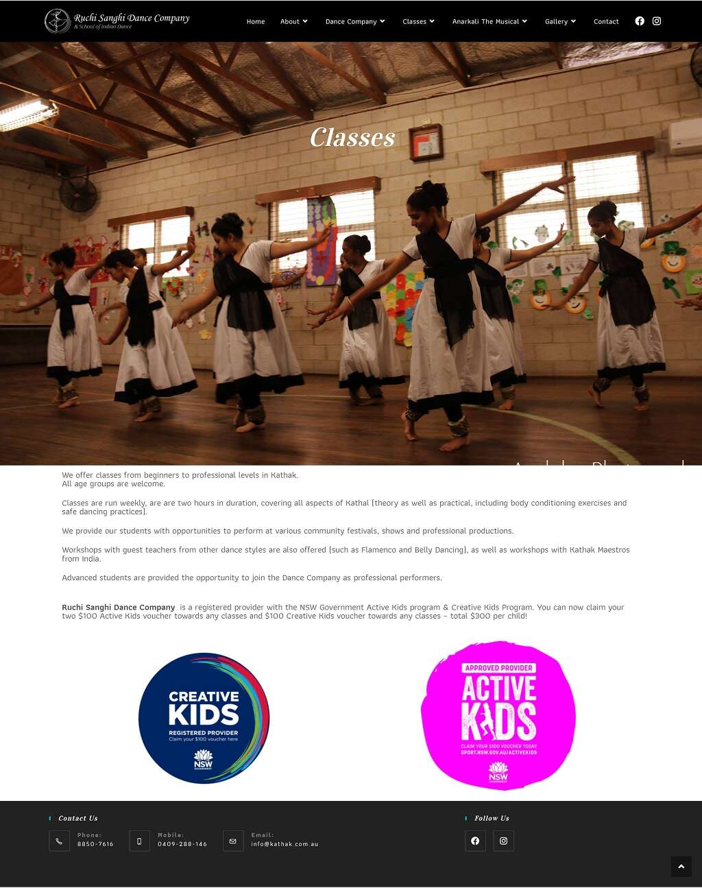
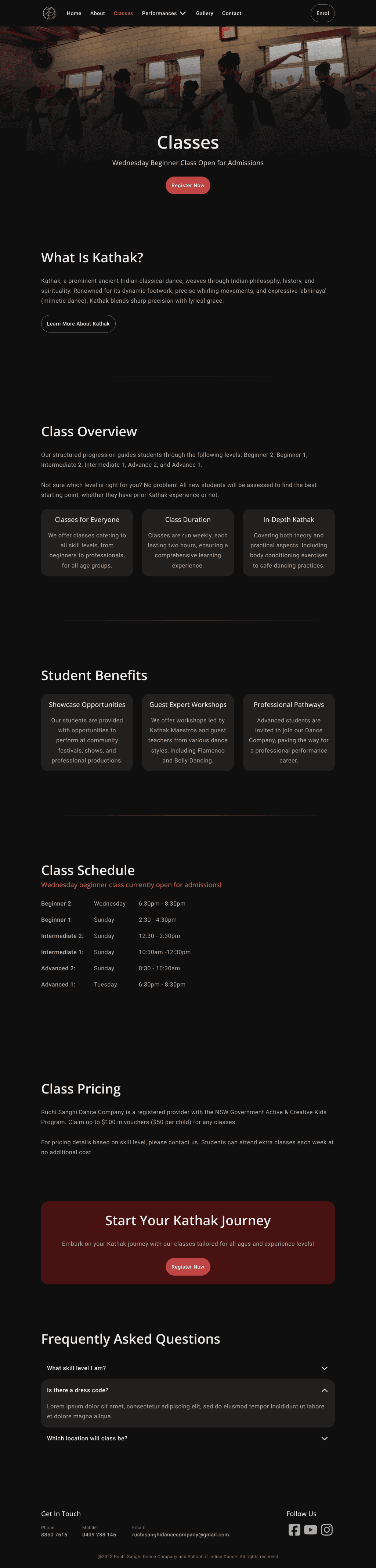
Brainstormed ideas for presenting the complex class structure using cards for each level.
Designed wireframes to validate new layouts and navigation paths. Each wireframe was designed with accessibility and ease of use in mind.
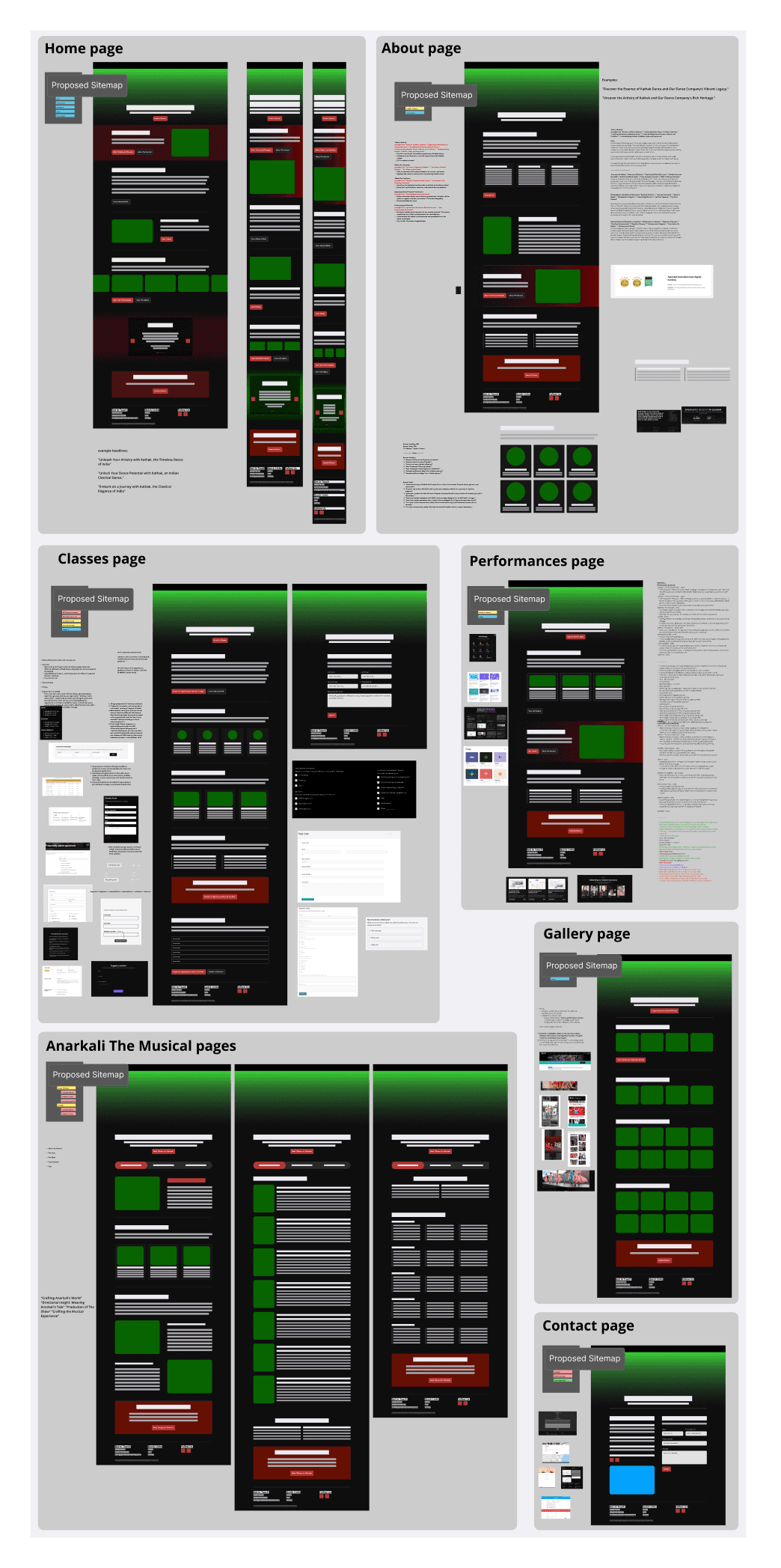
Information Architecture & Site Map
Information Architecture & Site Map
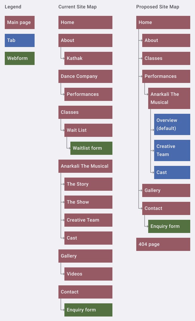
To improve navigation and reduce friction, I synthesised user research insights to refine the site’s information architecture and sitemap. The focus was on streamlining navigation and creating a clear path from the homepage to key pages: "Classes," "Book Events," and "Performances."
A tree test was conducted to evaluate and refine the navigational structure, ensuring that ‘Culturally Curious’ users could easily find essential information. The revised information architecture simplifies navigation by reducing redundant content, consolidating pages, and improving content hierarchy based on findings from the content audit and user research.
Key Changes & Improvements
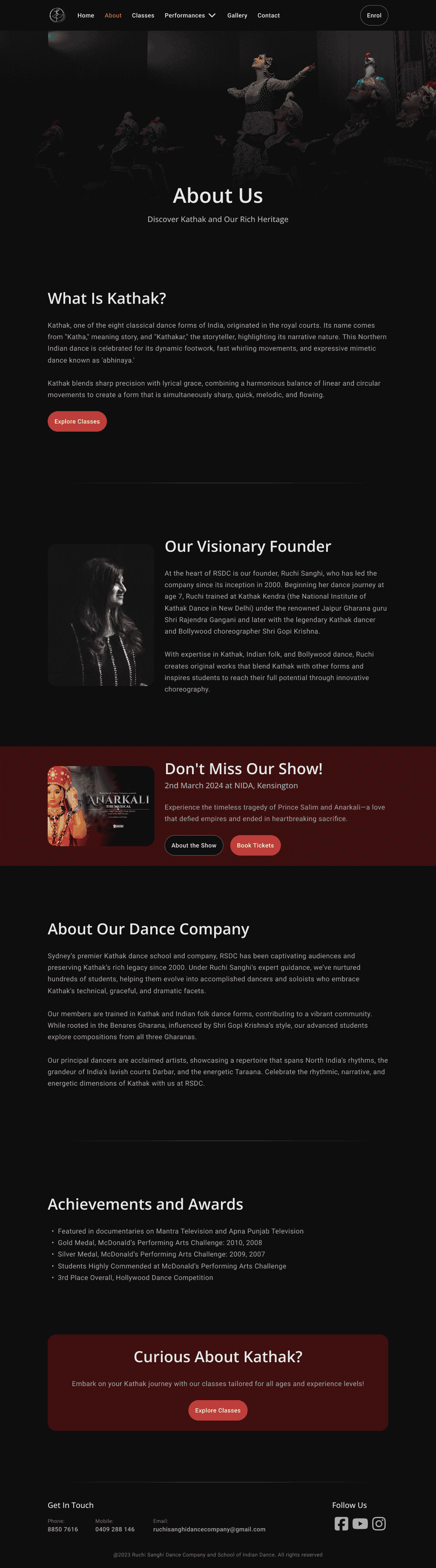
Merged ‘About,’ ‘Kathak,’ and ‘Dance Company’ pages into a single "About" page to reduce content overlap.
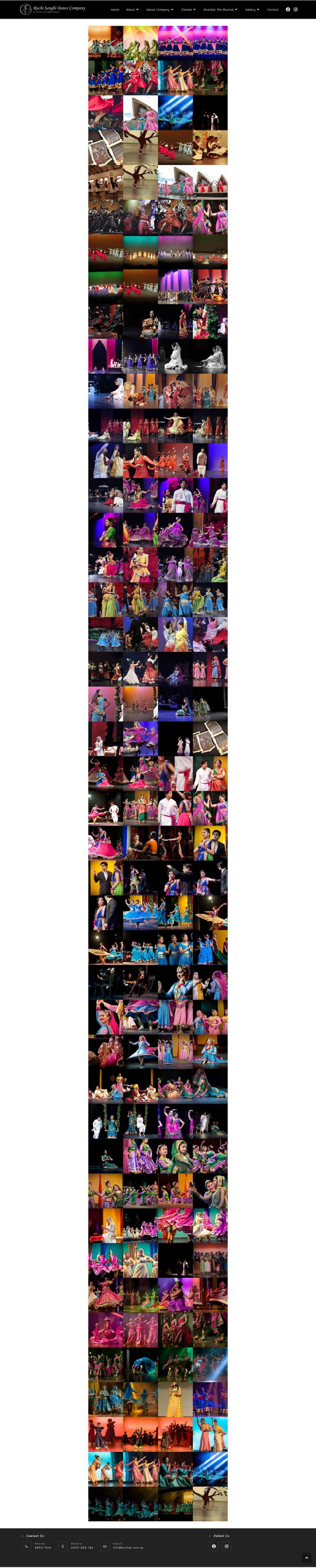
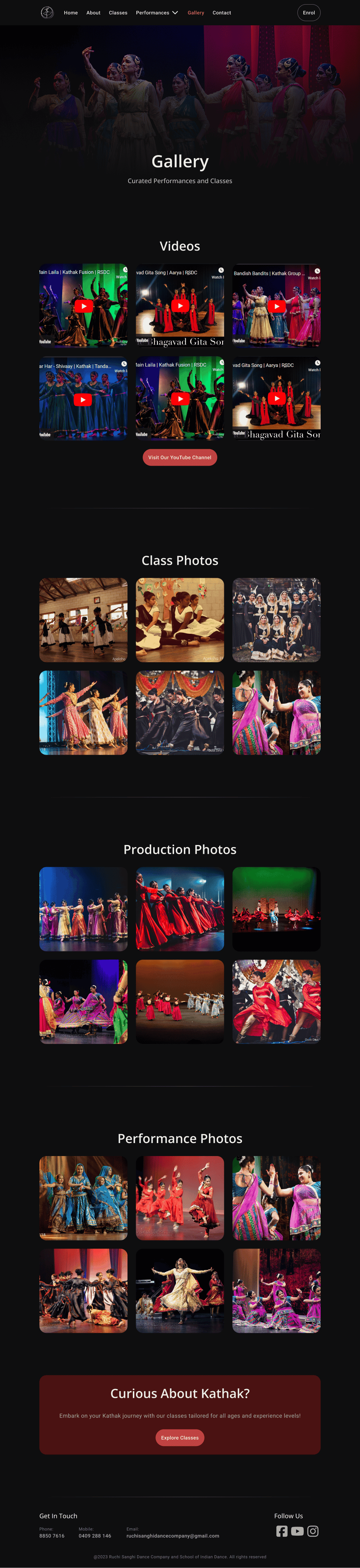
Combined ‘Gallery’ and ‘Videos’ into a unified "Gallery" page for a streamlined media experience.
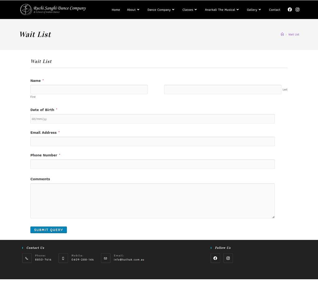
Consolidated two separate webforms (waitlist and general inquiries) into a single contact form on the "Contact" page.
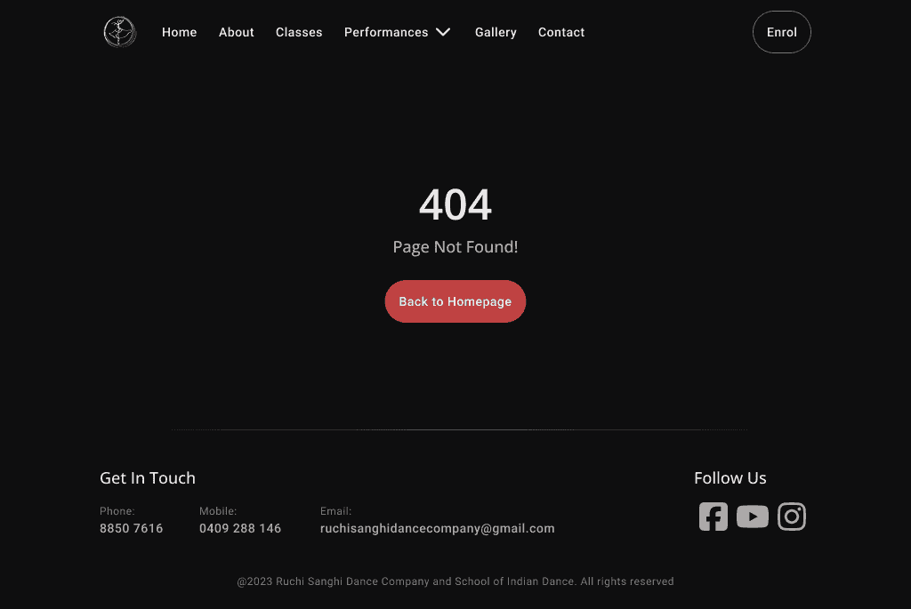
Introduced a 404 page to improve error handling and user guidance.
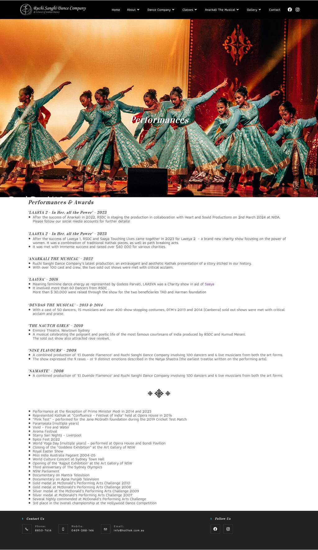
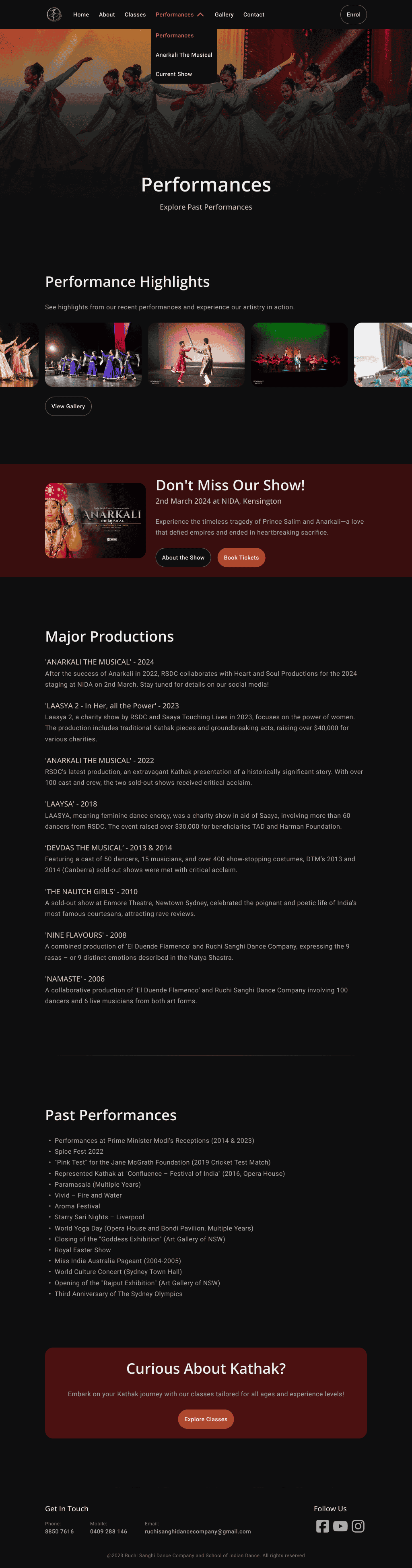
Reorganised ‘Anarkali The Musical’ under "Performances" based on tree testing feedback.
Restructured Kathak-related content:
A detailed explanation now sits on the "About" page.
Brief descriptions are added to the "Home" and "Classes" pages, aligning with user expectations from tree testing.
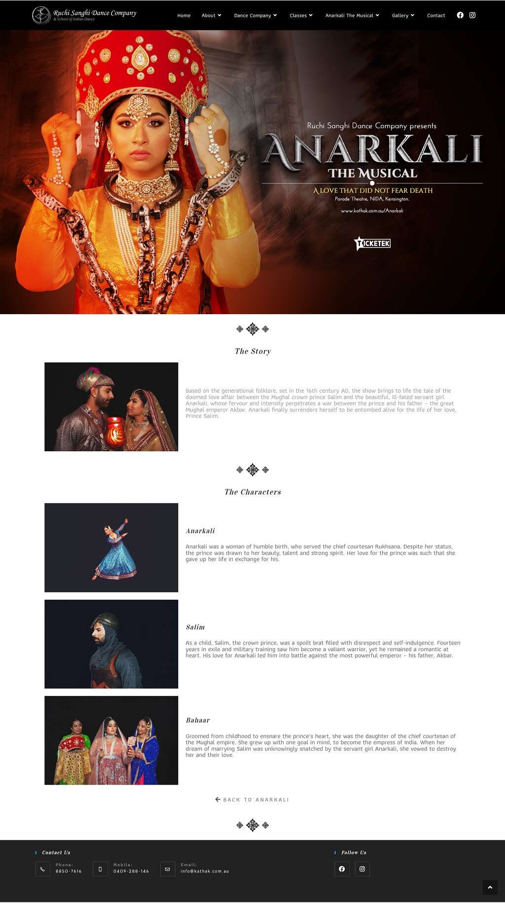
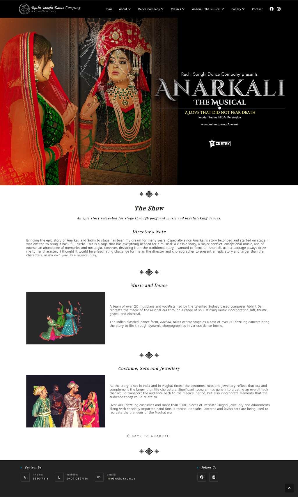
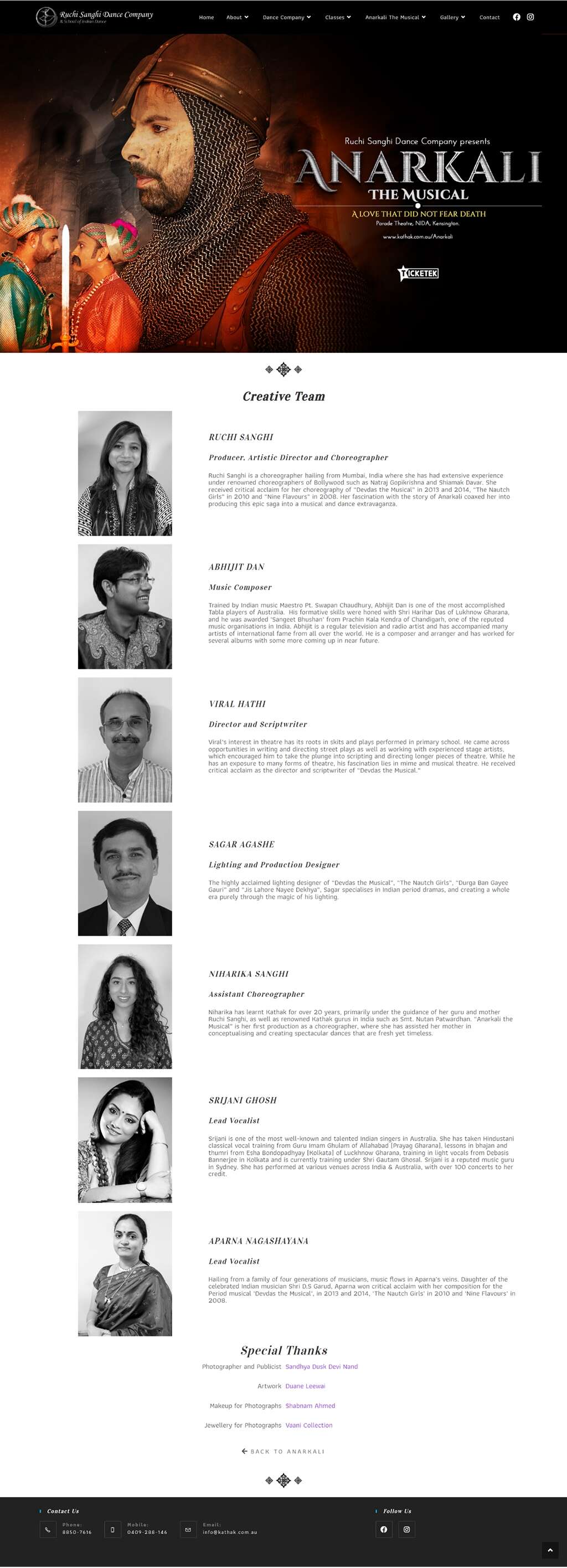
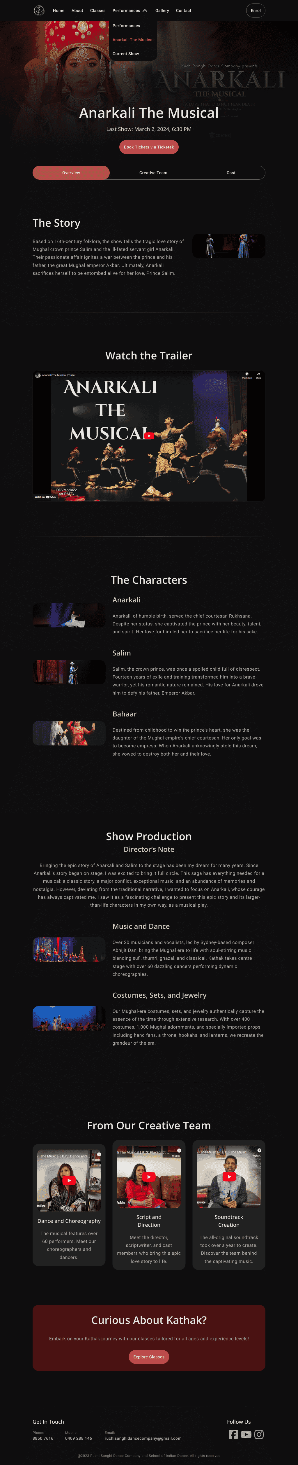
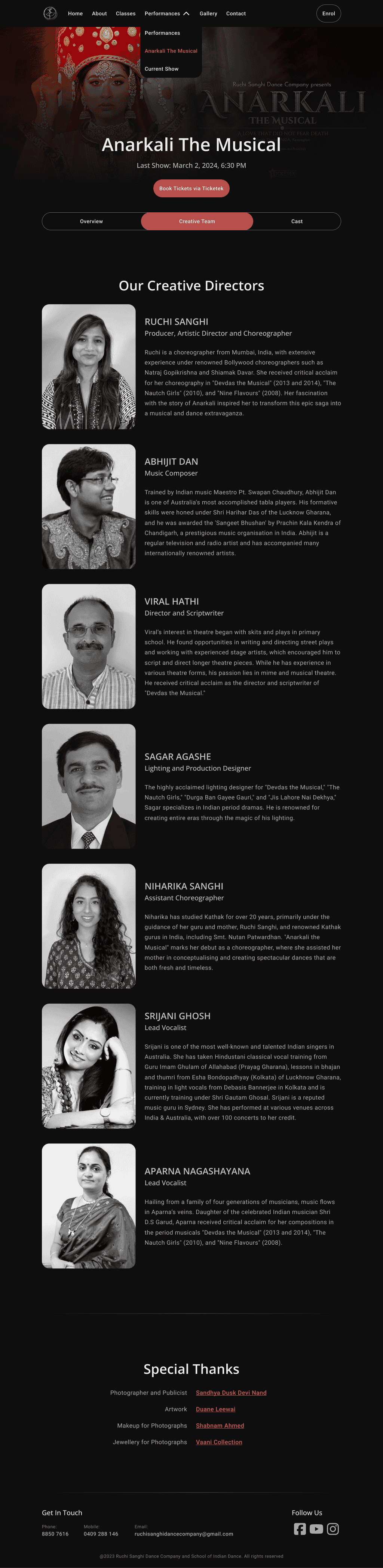
Condensed five separate ‘Anarkali The Musical’ pages into three tabs within a single dedicated page.
The revised sitemap ensures a more intuitive and user-friendly experience, reducing clicks to essential information and improving content discoverability.
To improve navigation and reduce friction, I synthesised user research insights to refine the site’s information architecture and sitemap. The focus was on streamlining navigation and creating a clear path from the homepage to key pages: "Classes," "Book Events," and "Performances."
A tree test was conducted to evaluate and refine the navigational structure, ensuring that ‘Culturally Curious’ users could easily find essential information. The revised information architecture simplifies navigation by reducing redundant content, consolidating pages, and improving content hierarchy based on findings from the content audit and user research.
Key Changes & Improvements
Merged ‘About,’ ‘Kathak,’ and ‘Dance Company’ pages into a single "About" page to reduce content overlap.
Combined ‘Gallery’ and ‘Videos’ into a unified "Gallery" page for a streamlined media experience.
Consolidated two separate webforms (waitlist and general inquiries) into a single contact form on the "Contact" page.
Introduced a 404 page to improve error handling and user guidance.
Reorganised ‘Anarkali The Musical’ under "Performances" based on tree testing feedback.
Restructured Kathak-related content:
A detailed explanation now sits on the "About" page.
Brief descriptions are added to the "Home" and "Classes" pages, aligning with user expectations from tree testing.
Condensed five separate ‘Anarkali The Musical’ pages into three tabs within a single dedicated page.
The revised sitemap ensures a more intuitive and user-friendly experience, reducing clicks to essential information and improving content discoverability.
User Testing
User Testing
Key task completion tested: Registering for a class, submitting event booking inquiries, and finding performance schedules.
Scrolling image row test: Evaluated a scrolling gallery row but identified accessibility concerns—users need control over motion. The scrolling row should move slowly, allow images to expand when clicked, and pause on hover. Additionally, it should respect users’ ‘prefers-reduced-motion’ settings to enhance accessibility.
User feedback: Positive responses to the clean redesign and clearer class structure.
Content requests: Users expressed the need for visible pricing information and class schedules.
Refining the Contact Form: Feedback-Driven Iterations
Refining the Contact Form: Feedback-Driven Iterations
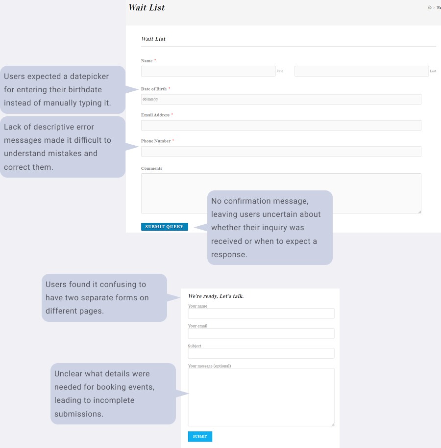
Current Form (Before Redesign)
The original contact form had usability issues that created friction for users. Having separate forms on different pages caused confusion, and users struggled to understand what information was required—especially for event bookings. The form also lacked essential features like clear error messages and a confirmation message, leaving users unsure if their inquiry was successfully submitted.
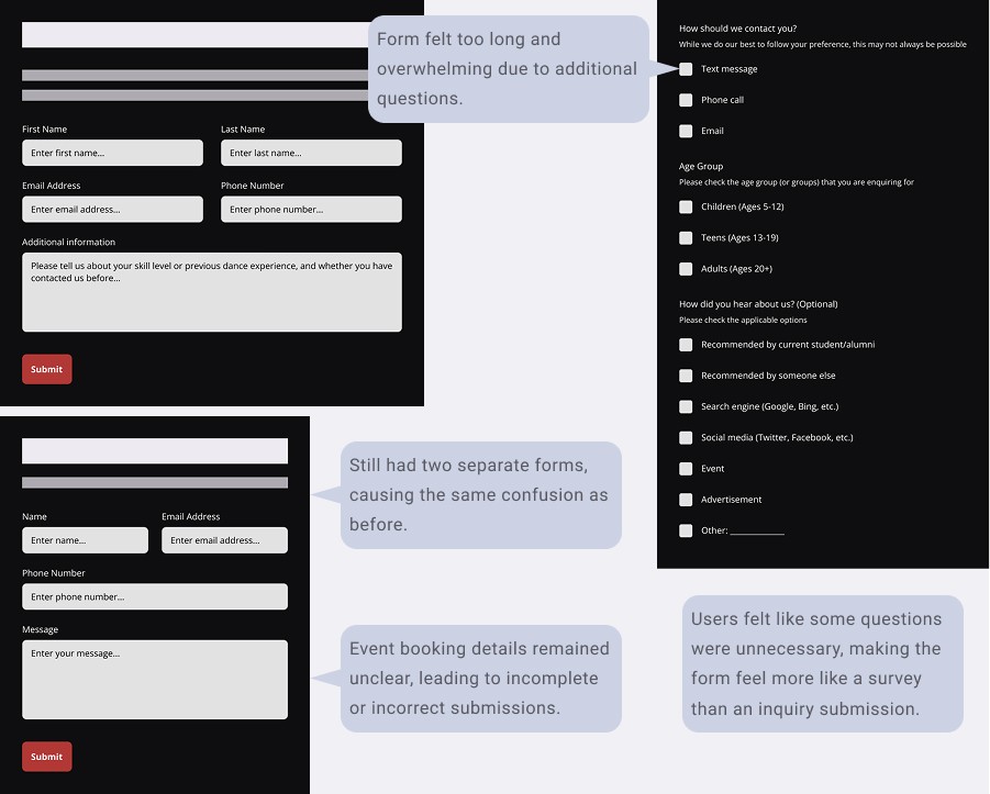
Iteration 1-4: Initial Revision & Testing (Initial Improvements)
Based on user feedback, we revised the form to include more detailed questions, aiming to gather all necessary information upfront. However, this version felt too long and overwhelming. Users still found event booking details unclear, and having two separate forms remained an issue. Additionally, some questions felt unnecessary, making the form feel more like a survey than a streamlined inquiry process.
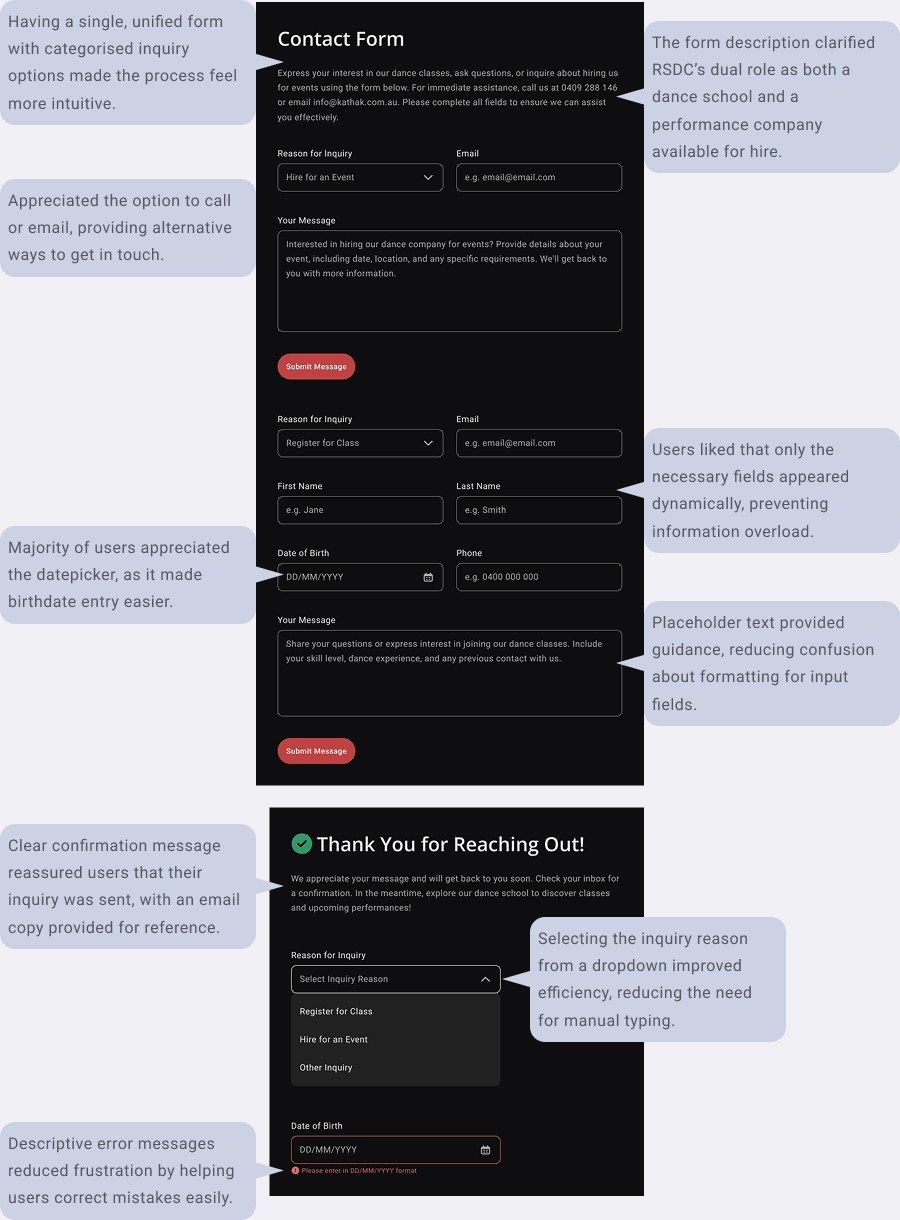
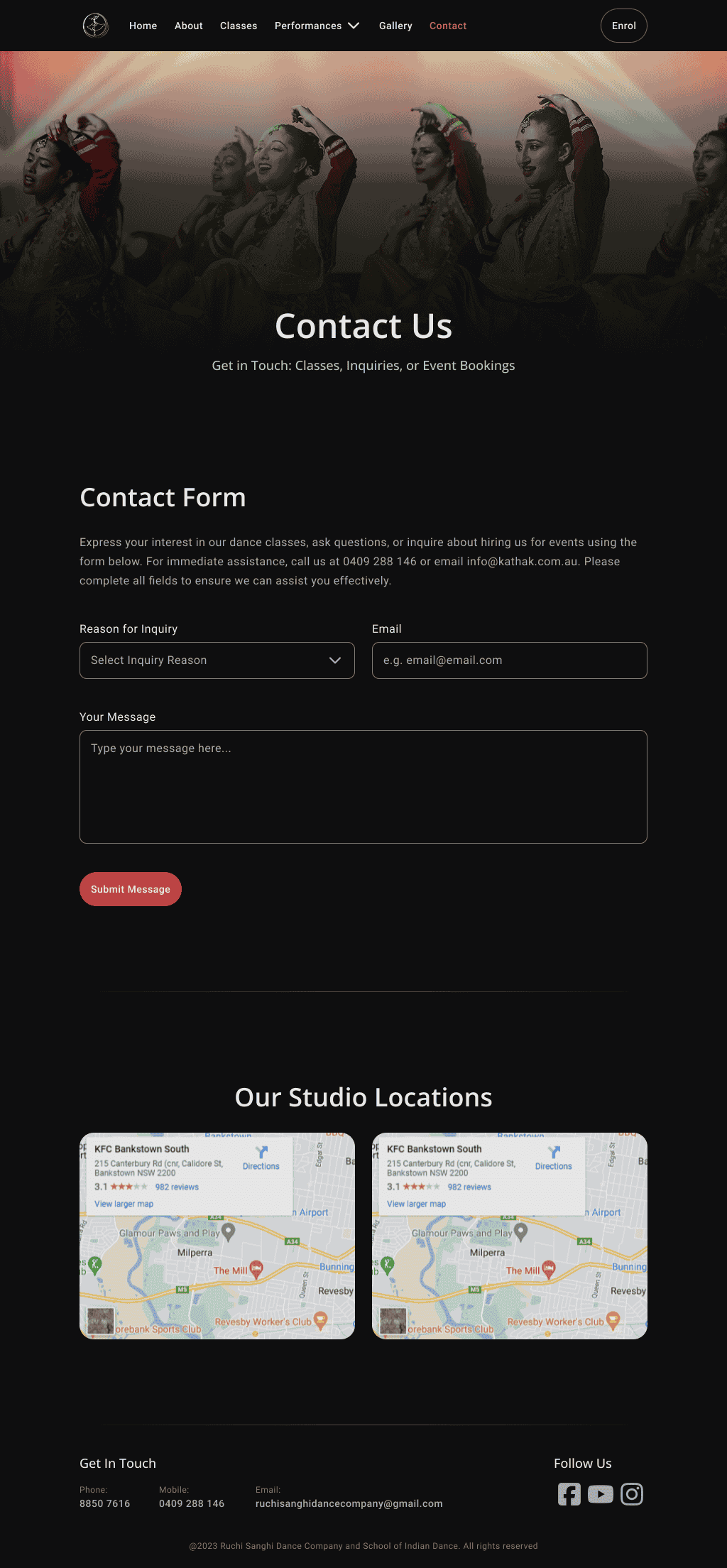
Iteration 5: Final Design (Optimised for Usability)
This iteration addressed previous concerns by consolidating the forms into one, introducing a dropdown menu for selecting the inquiry type, and dynamically displaying only relevant fields. Users appreciated the datepicker feature, clearer error messages, and a confirmation message that reassured them their inquiry was submitted. The addition of alternative contact options (phone and email) further enhanced usability, while placeholder text helped guide users on proper formatting.
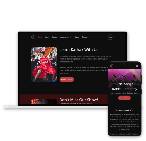
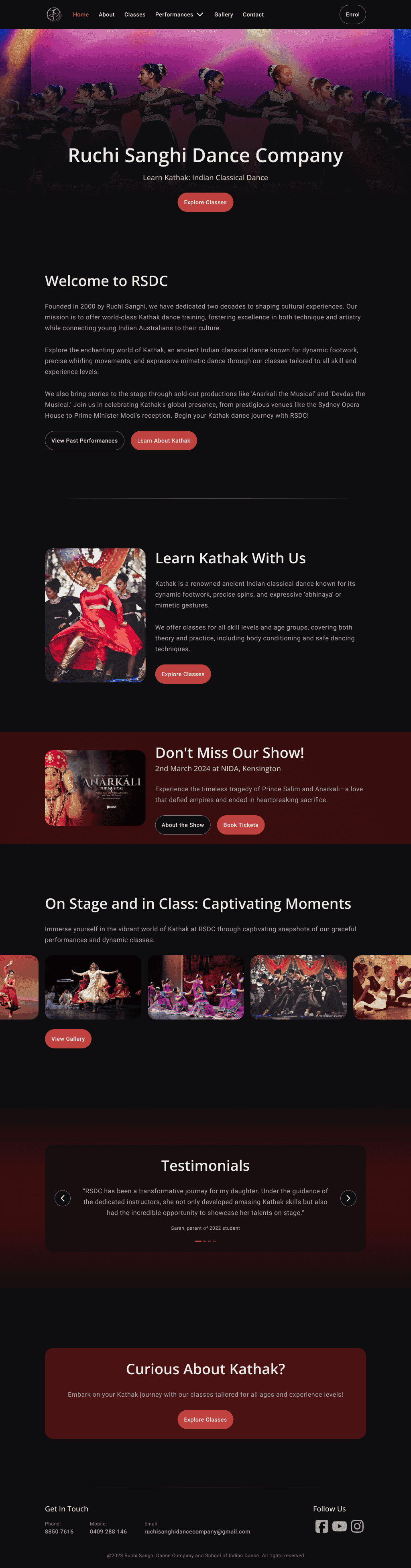
Final Design
Final Design
Explore all the mockups in Figma (including the tablet and mobile mockups for a complete look at the responsive experience), including annotations on key design decisions, user testing insights, and data-driven improvements.

Outcome
Outcome
Centralised Homepage
Centralised Homepage
Serves as a hub, offering a clear overview and guides to key pages.
Serves as a hub, offering a clear overview and guides to key pages.
Intuitive Navigation
Intuitive Navigation
Streamlined for easier access and reduced friction.
Streamlined for easier access and reduced friction.
Accessibility Focused
Accessibility Focused
Met a minimum of WCAG 2.1 AA to ensure the site was inclusive.
Met a minimum of WCAG 2.1 AA to ensure the site was inclusive.
Effective CTAs
Effective CTAs
Prominent "Explore Classes" button and CTA banners for performances drive user engagement.
Prominent "Explore Classes" button and CTA banners for performances drive user engagement.
Class Information
Class Information
Presented in a clean, card-based layout for better clarity and understanding.
Presented in a clean, card-based layout for better clarity and understanding.
Streamlined Inquiries
Streamlined Inquiries
Simplified booking and inquiry processes for a smoother user experience.
Simplified booking and inquiry processes for a smoother user experience.
Metrics & Projected Outcomes
Metrics & Projected Outcomes
+35% Engagement
+35% Engagement
Achieved within the first quarter, due to enhanced navigation, visuals, and content scannability.
Achieved within the first quarter, due to enhanced navigation, visuals, and content scannability.
+25% Inquiries
+25% Inquiries
Expected within the first quarter, due to consolidating forms into a streamlined dynamic contact form.
Expected within the first quarter, due to consolidating forms into a streamlined dynamic contact form.
-20% Bounce Rate
-20% Bounce Rate
Projected within 2 months of launch, thanks to improved clarity in information and layout.
Projected within 2 months of launch, thanks to improved clarity in information and layout.
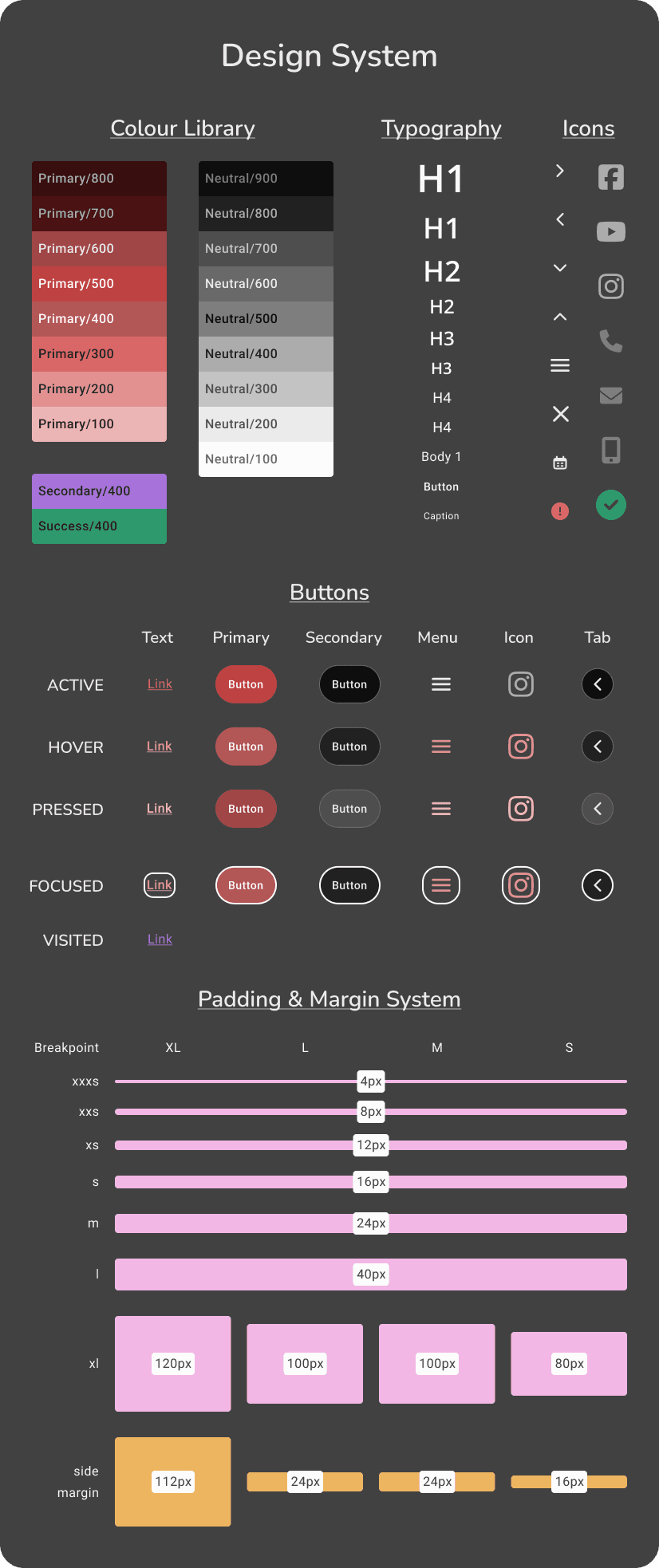
Design System Overview
Design System Overview
Learnings & Next Steps
Learnings & Next Steps
Learnings:
Simplifying navigation and improving scannability without losing detail was essential.
Shortening form fields and copy made the site more approachable, reducing friction.
Applying UX writing principles boosted content readability and engagement.
Using the homepage as a central hub provided users with intuitive navigation and quicker access to key sections, reducing the need to dig through irrelevant content.
Next Steps:
Continue A/B testing to optimise form fields and key elements (e.g., CTAs, forms) for better conversion.
Collaborate with the client to display pricing information to further reduce user drop-offs.
Set up analytics to monitor user behaviour, traffic, and conversion metrics for ongoing optimisation.
Focus on SEO to improve visibility and increase organic traffic.
